
Brand Visual Identity
Define the strategy, purpose and audience for a new company, and then design core visual elements of logo, color, and typography.

Outdoor store signage
Background
Generations is an online company that helps people capture and pass on their family stories, from one generation to the next. Stories from older generations help children to understand where they came from, to feel a sense of belonging and connection, and to understand family values. We connect with and remember stories, and this process over time can help us develop our sense of self and resilience in the face of challenging situations.
The target audience is adults in their 40s-50s with aging elderly parents. They want to capture and pass down these stories - while their elderly parents can still remember and clearly articulate them.
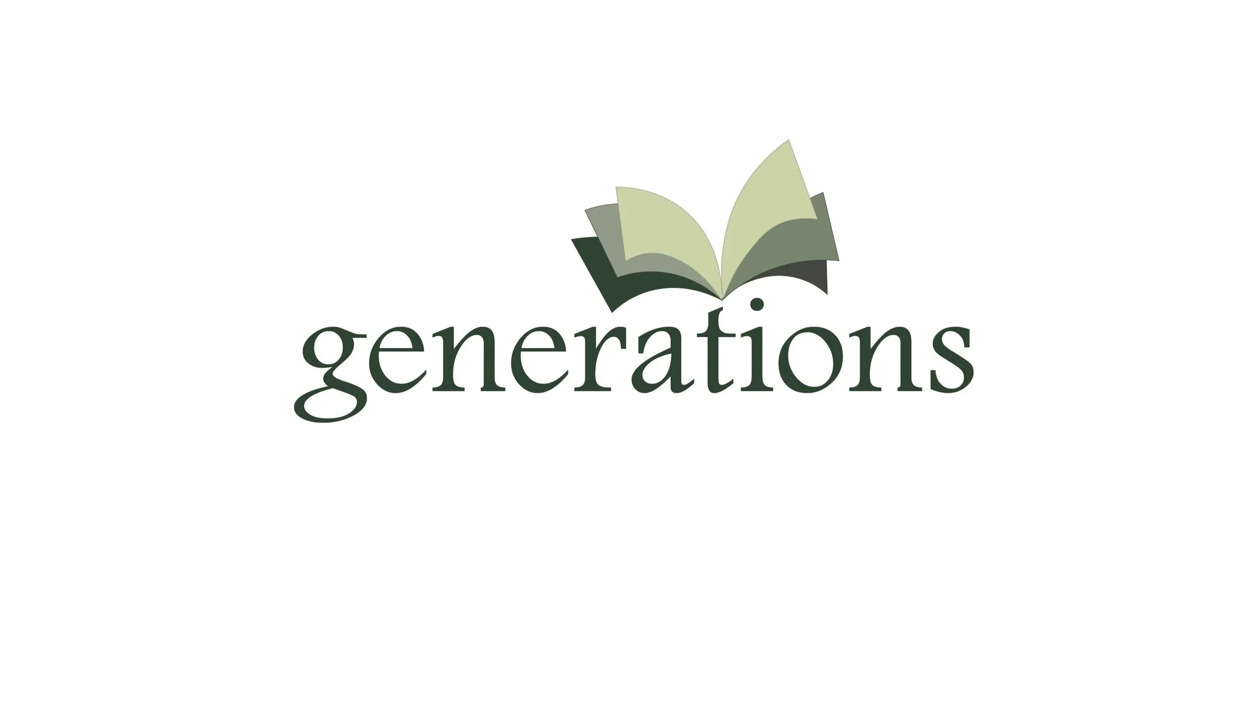
The logo should embody the qualities of connection, family, values, learning, and gratitude.
Design Solution
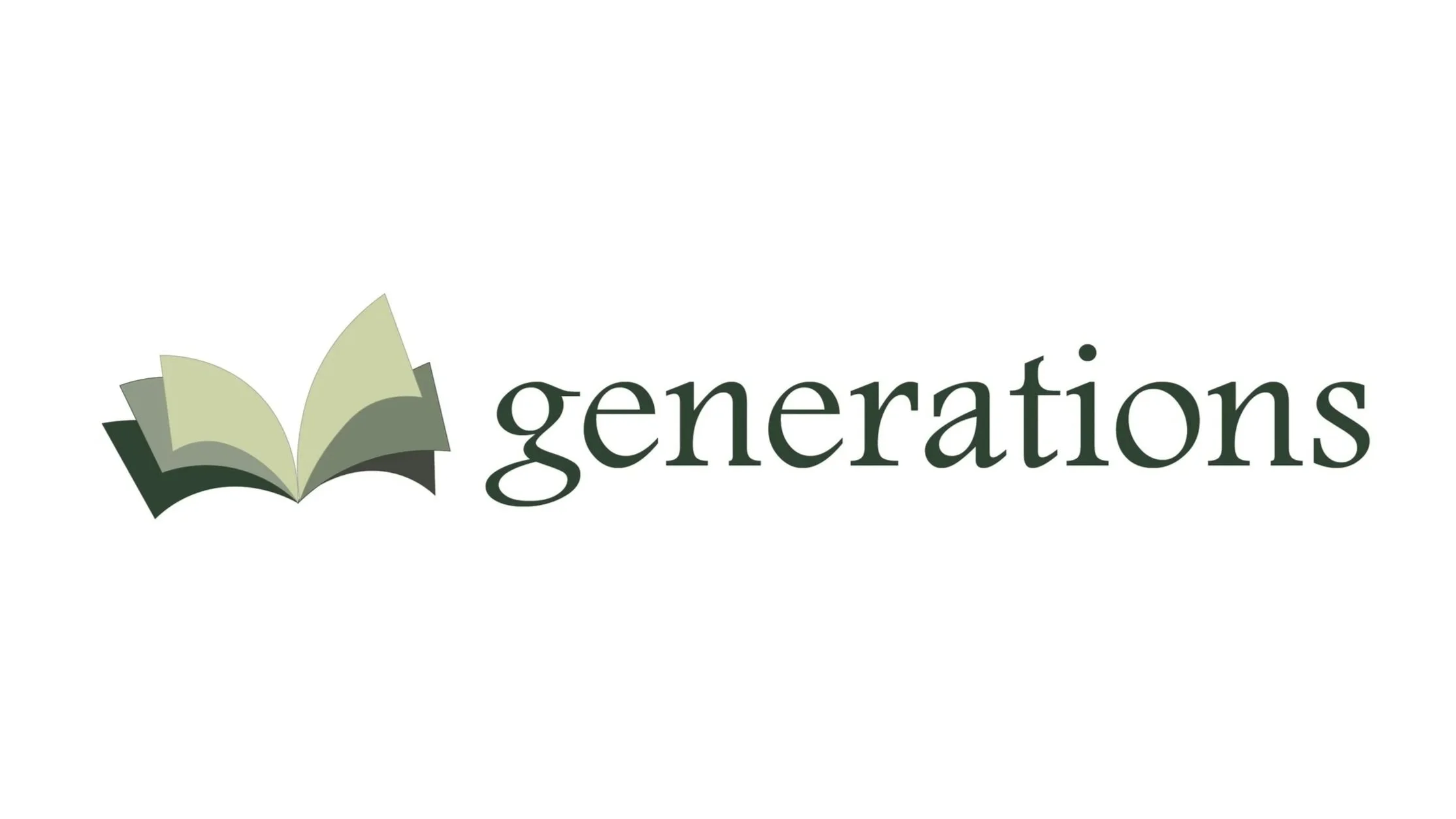
LOGOMARK: Open book pages symbolize memories. Each page is a unique memory, filled with its own narrative, emotions, and lessons. Collectively, they represent a legacy of stories that we share and pass down to our younger generations. Green symbolizes growth.
LOGOTYPE: Footlight MT Pro
A serif typeface with a lively and elegant design, named for the theatrical sparkle it can impart to text. It has an informal and lively feel while still conveying a sense of authority. This storytelling company captures and preserves stories from older generations to pass on to its younger generations, thus passing on traditions and memories.
Generations logo - vertical (stacked) in color
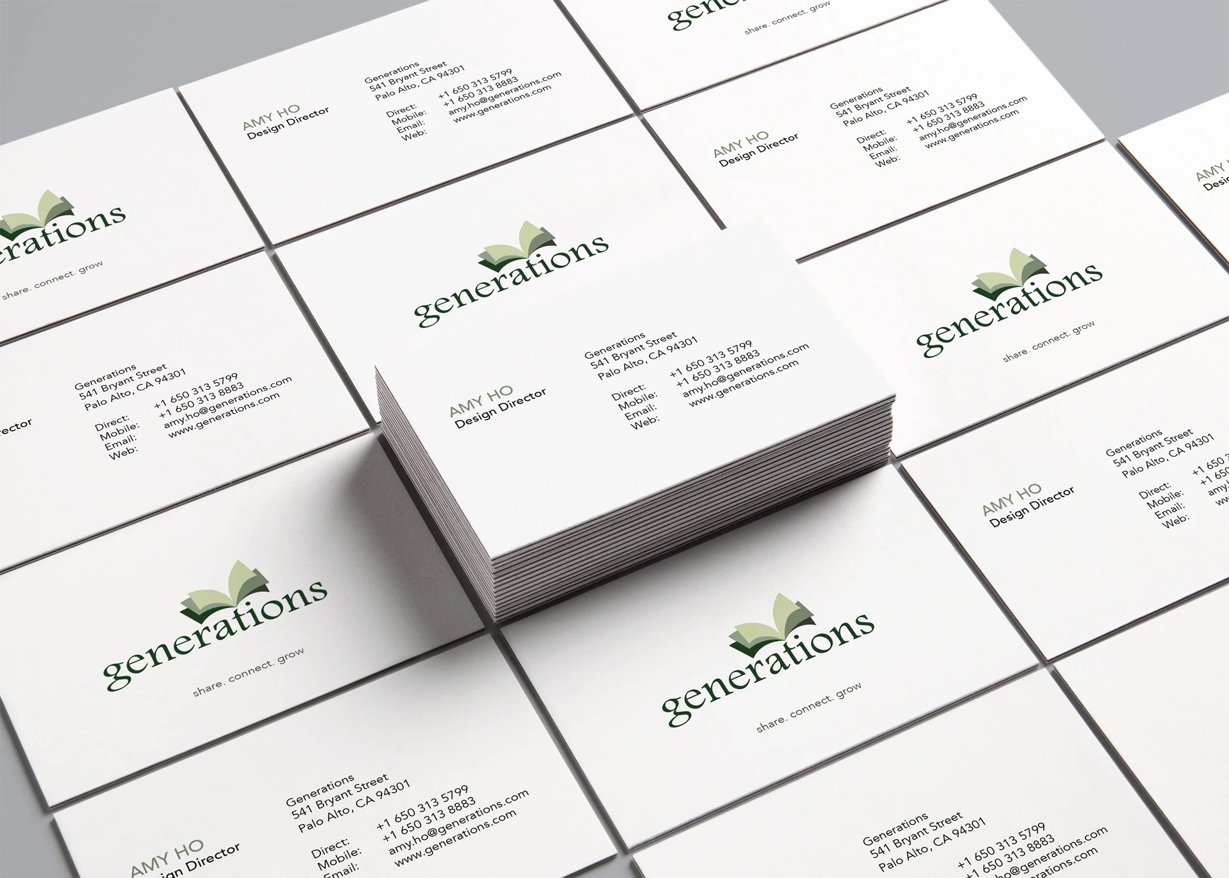
Business Cards with logo
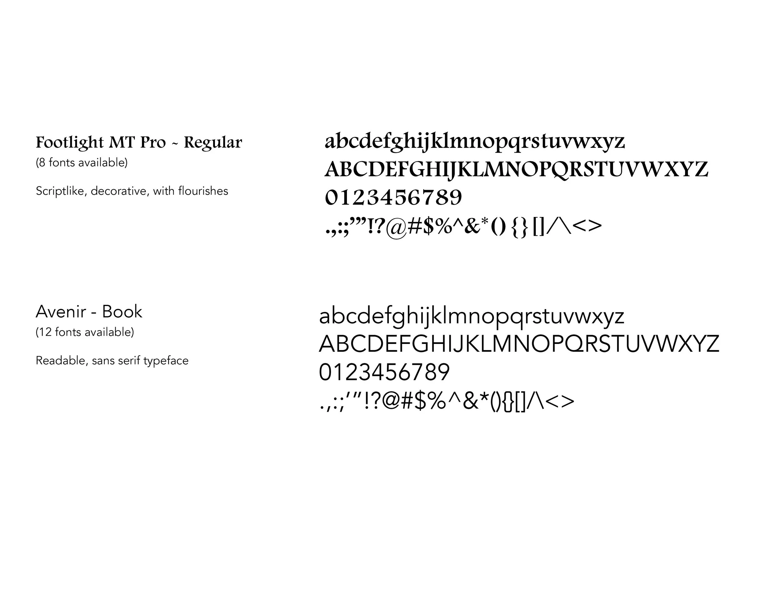
Brand Typeface
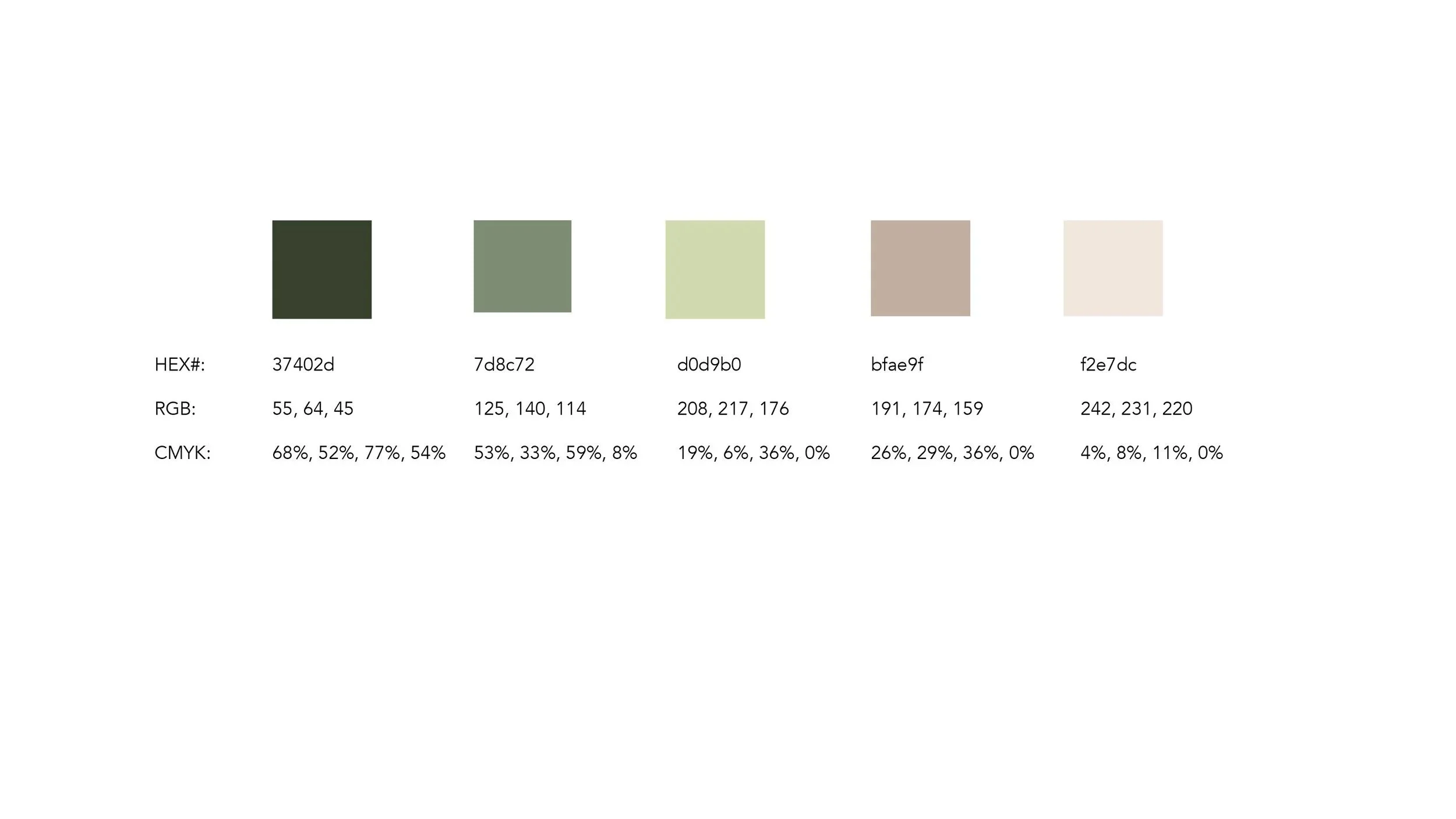
Brand Colors
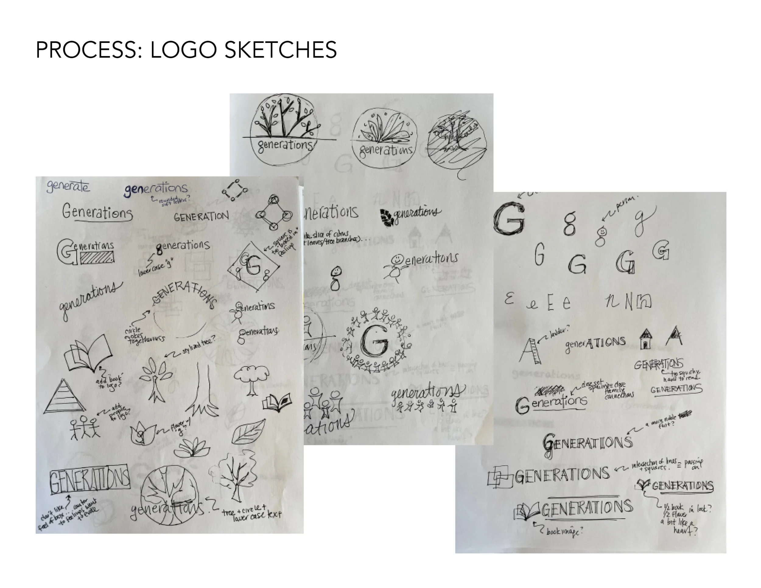
Design Process
I started with a design brief which included company overview, target audience, and 5 adjectives. From this, I explored possible concepts, starting with hand sketches and then rendering select ones in Illustrator. I explored different colors for the logomark and different typefaces for the logotype, deciding on green for growth and Footlight MT Pro for its double-story lowercase “g."
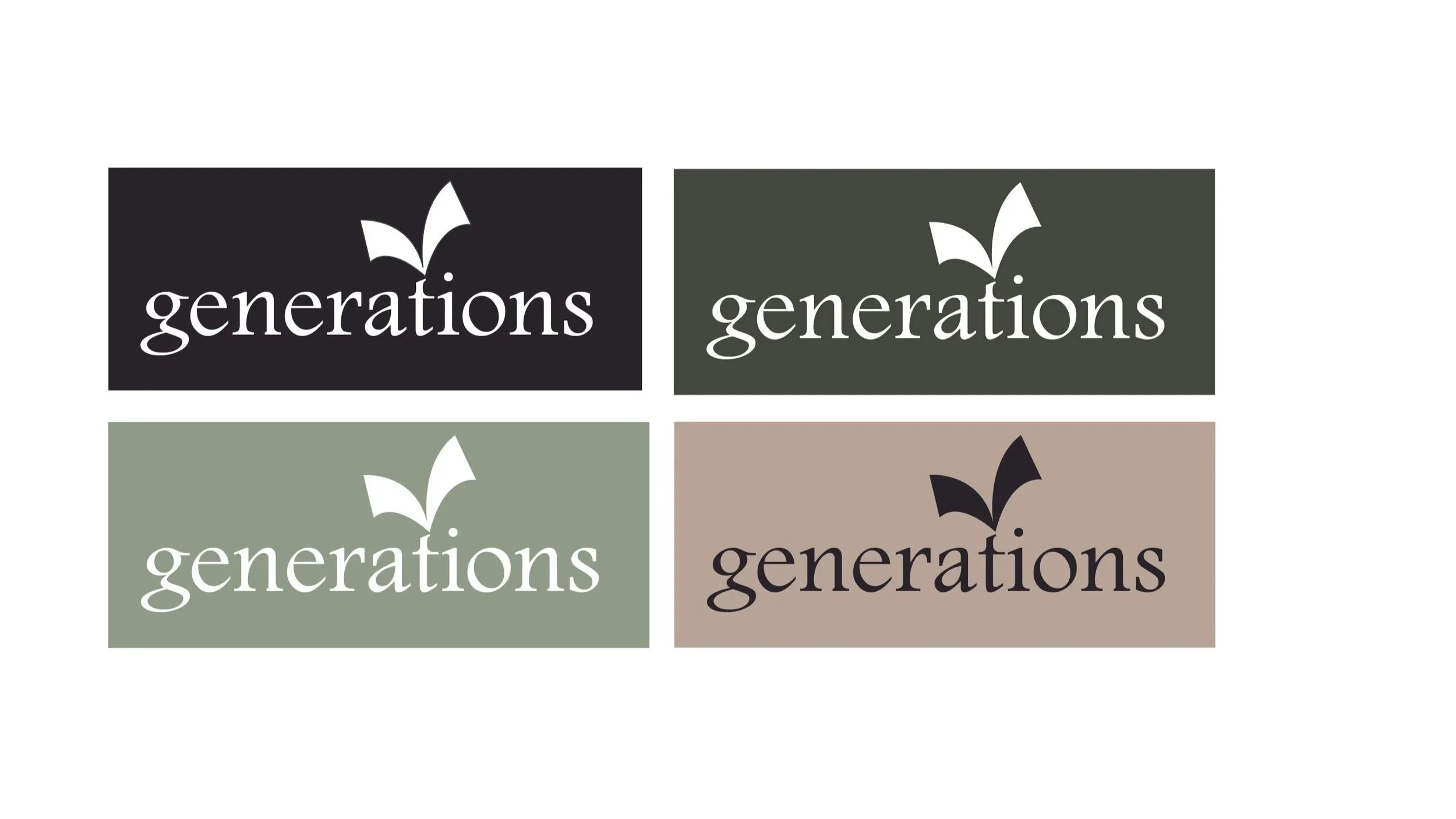
The primary logo is a stacked (vertical) orientation, which is used on the business cards. Alternative logo designs include a horizontal orientation in color, which is used for long signage. There is a simplified logo for use with reverse color and with smaller sizes (like website and favicon). Alignment of logomark relative to logotype are specified in the branding guidelines.
Software: Illustrator, InDesign, Photoshop
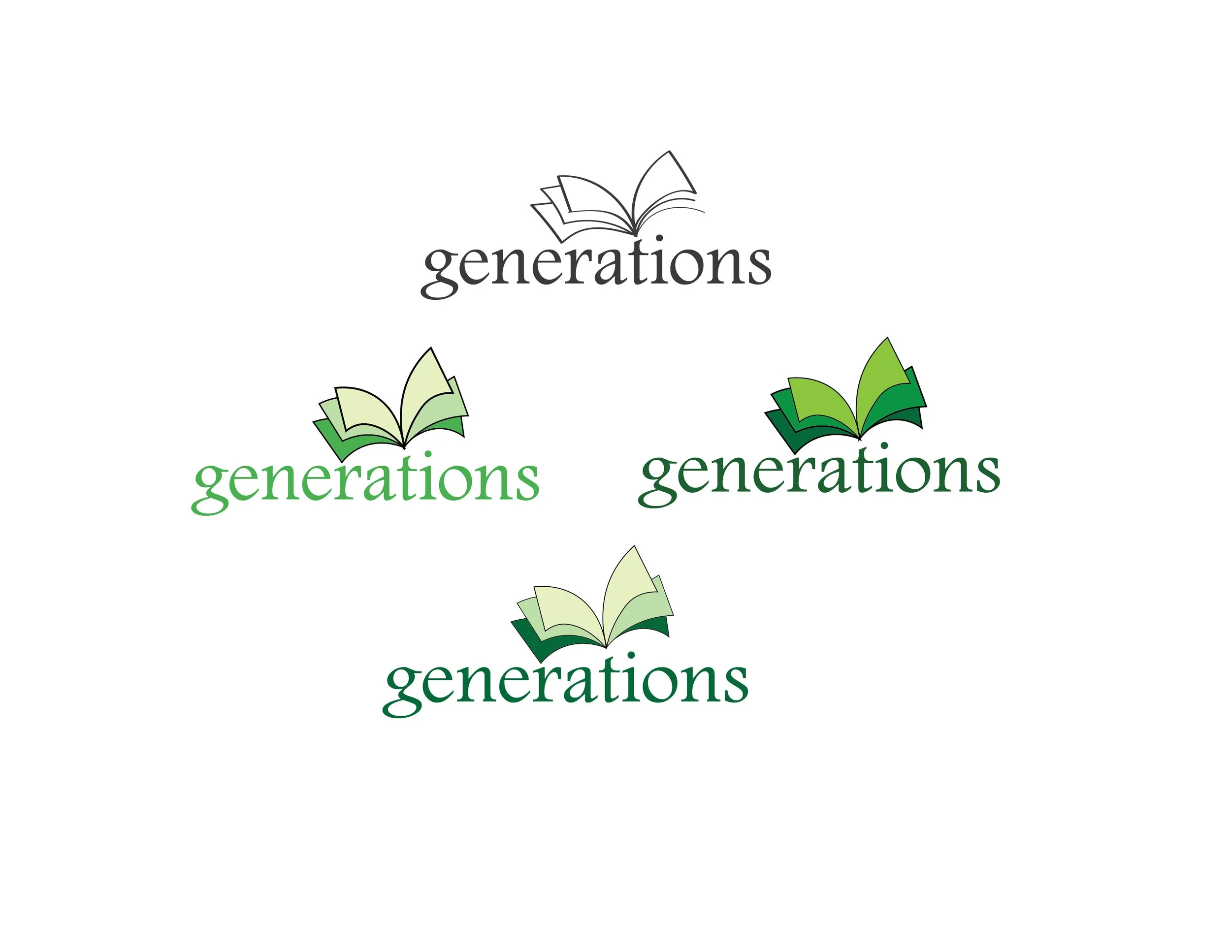
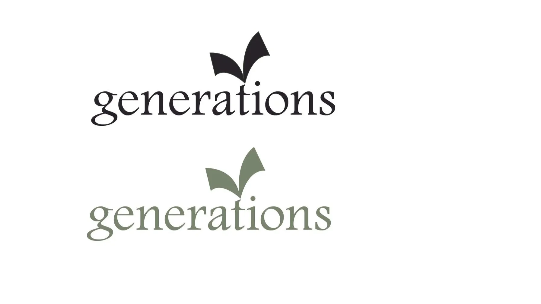
Logo in initial colors
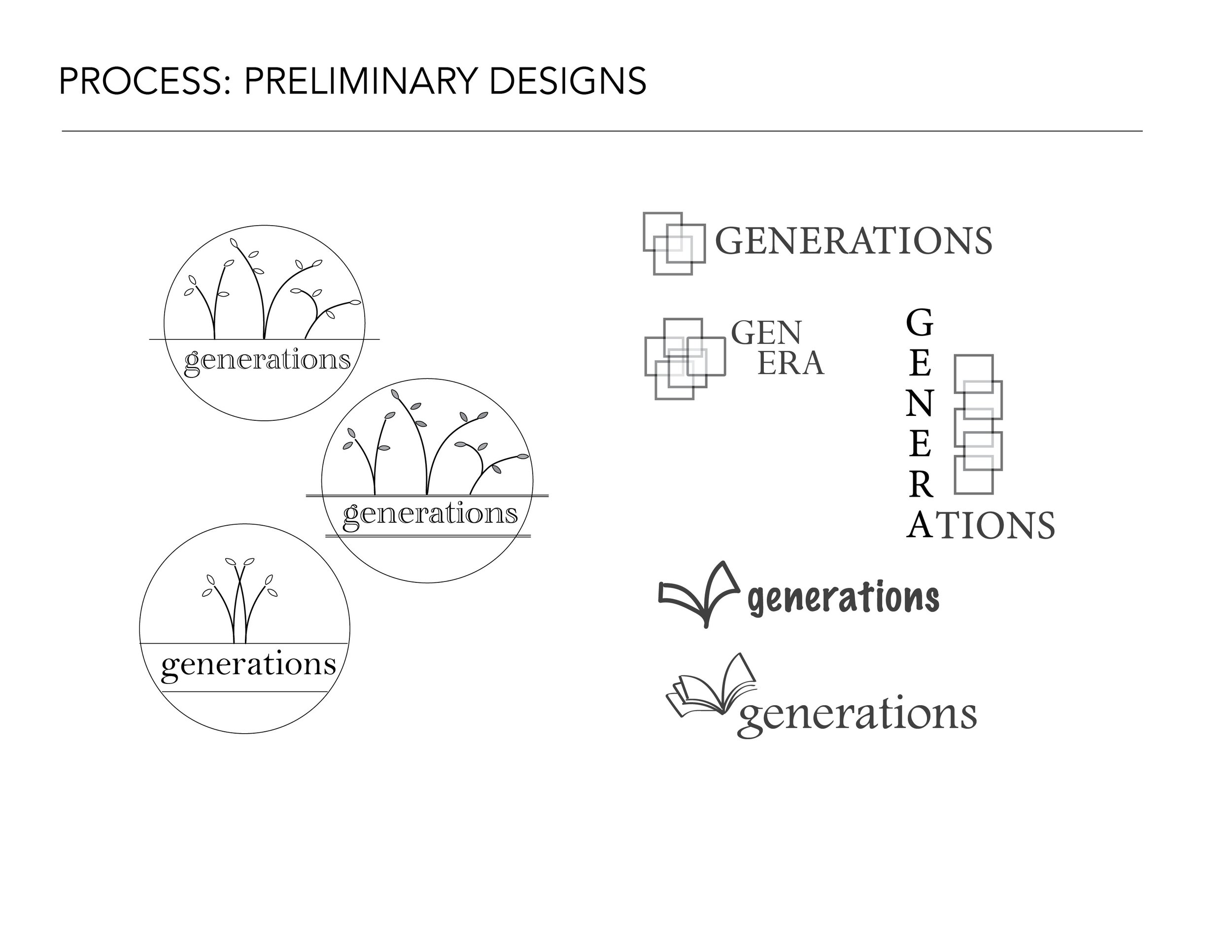
Preliminary Designs
Refinement of logo design and colors
Horizontal Logo
Reverse color with simplified logo
Simplified logo, for small size use
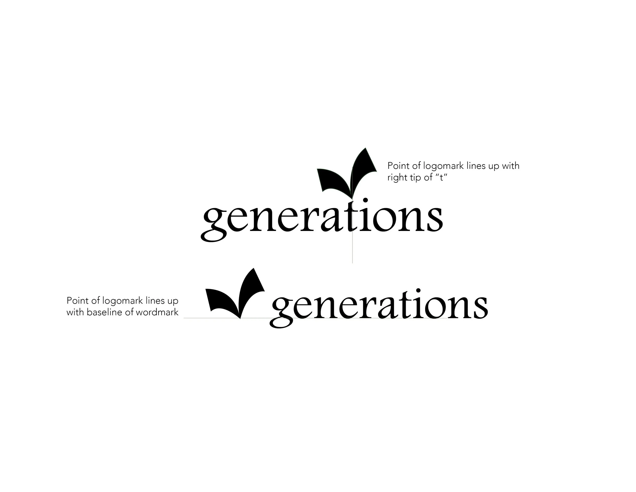
Logo guidelines
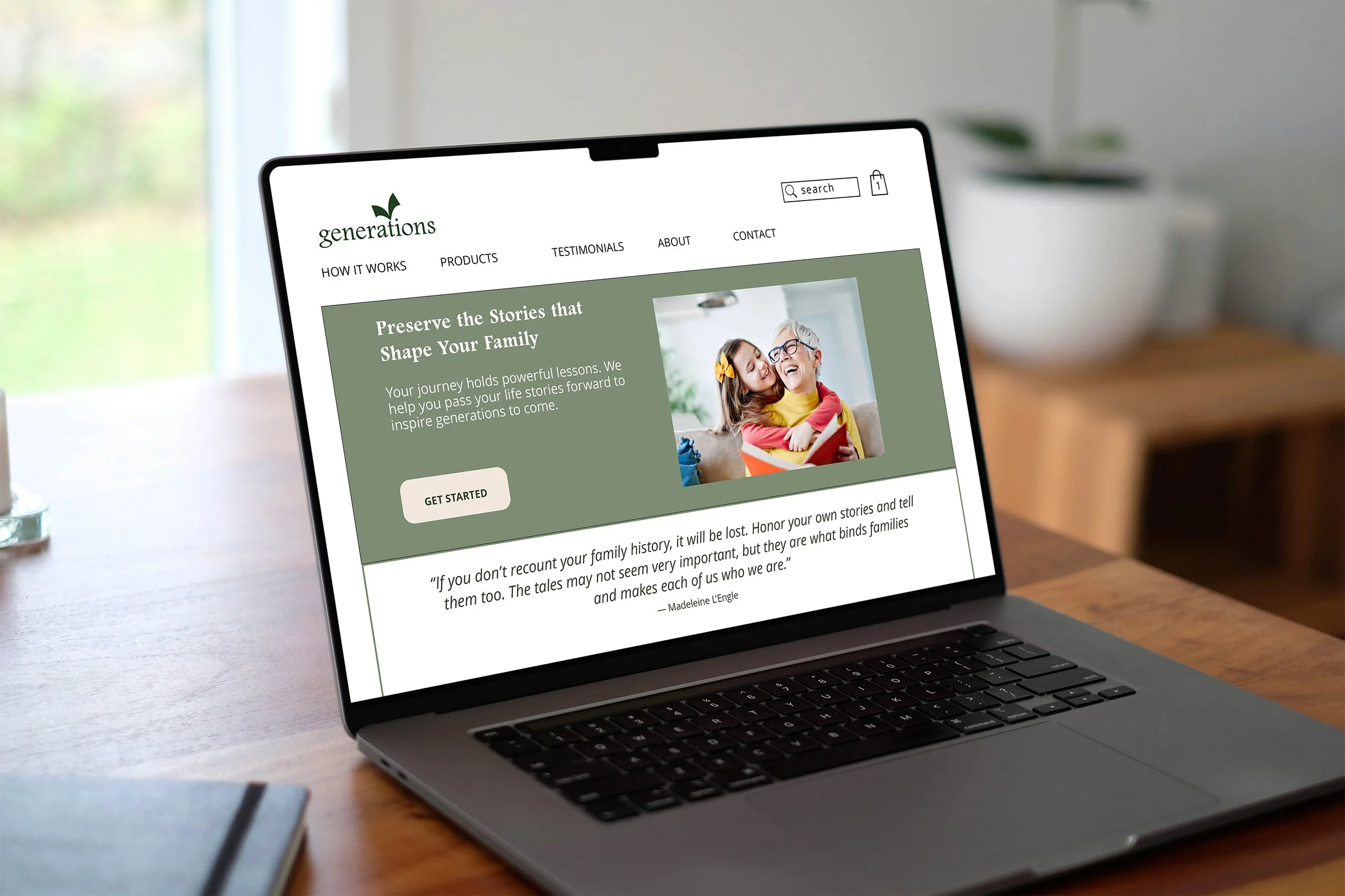
Website homepage on desktop
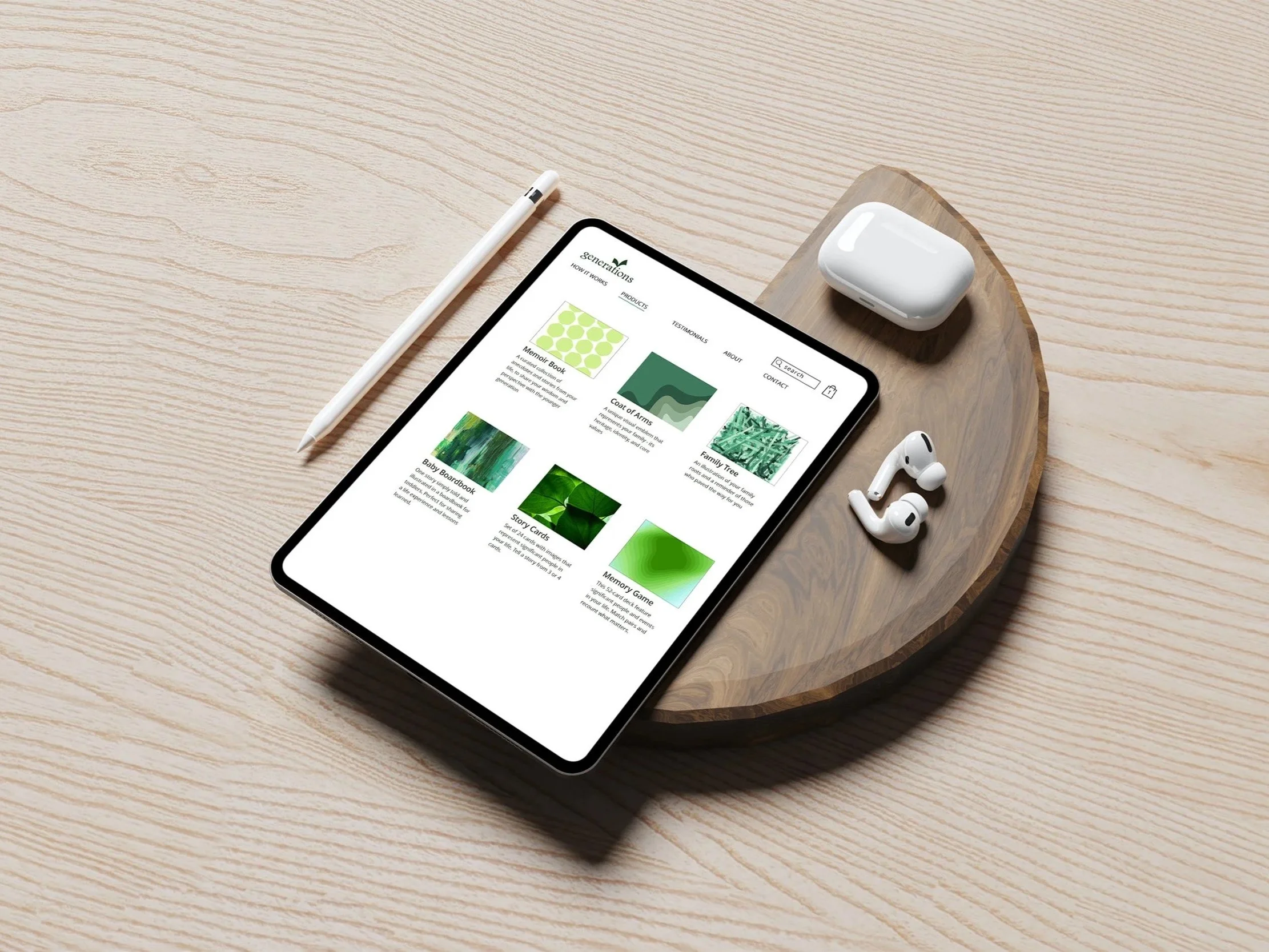
Products page on iPad
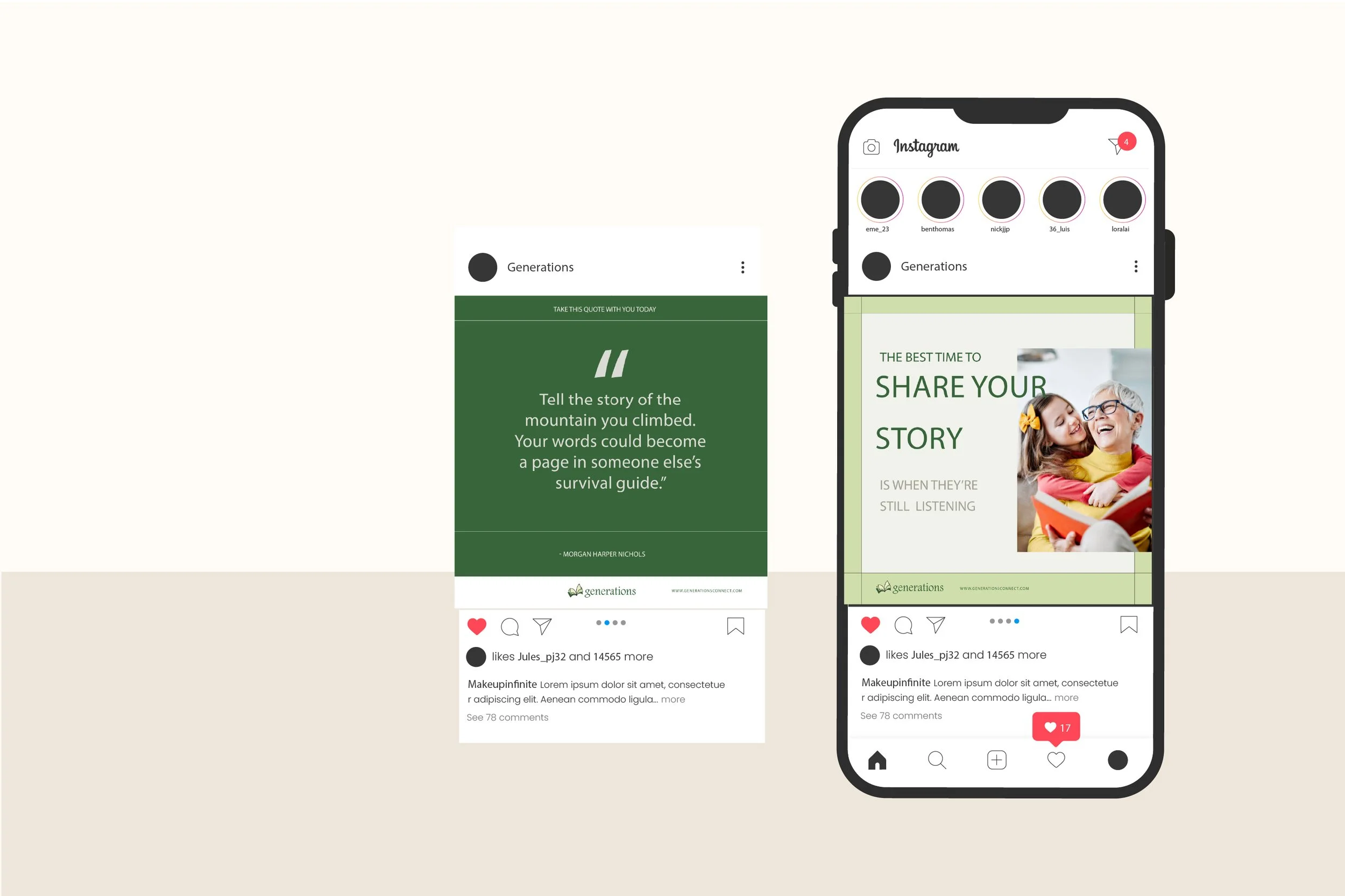
Social media post
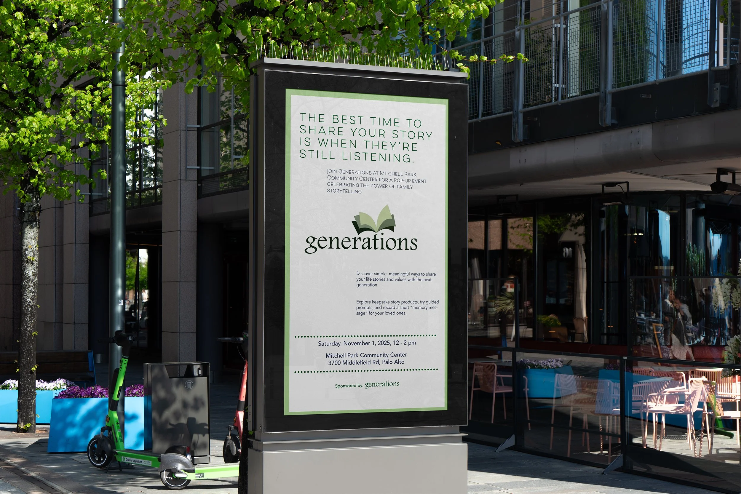
Poster for Pop Up Event