
Book Design
Re-design a scientific book so that it is more inviting and readable for a lay audience, from the design of the book covers to the layout of the inner pages.

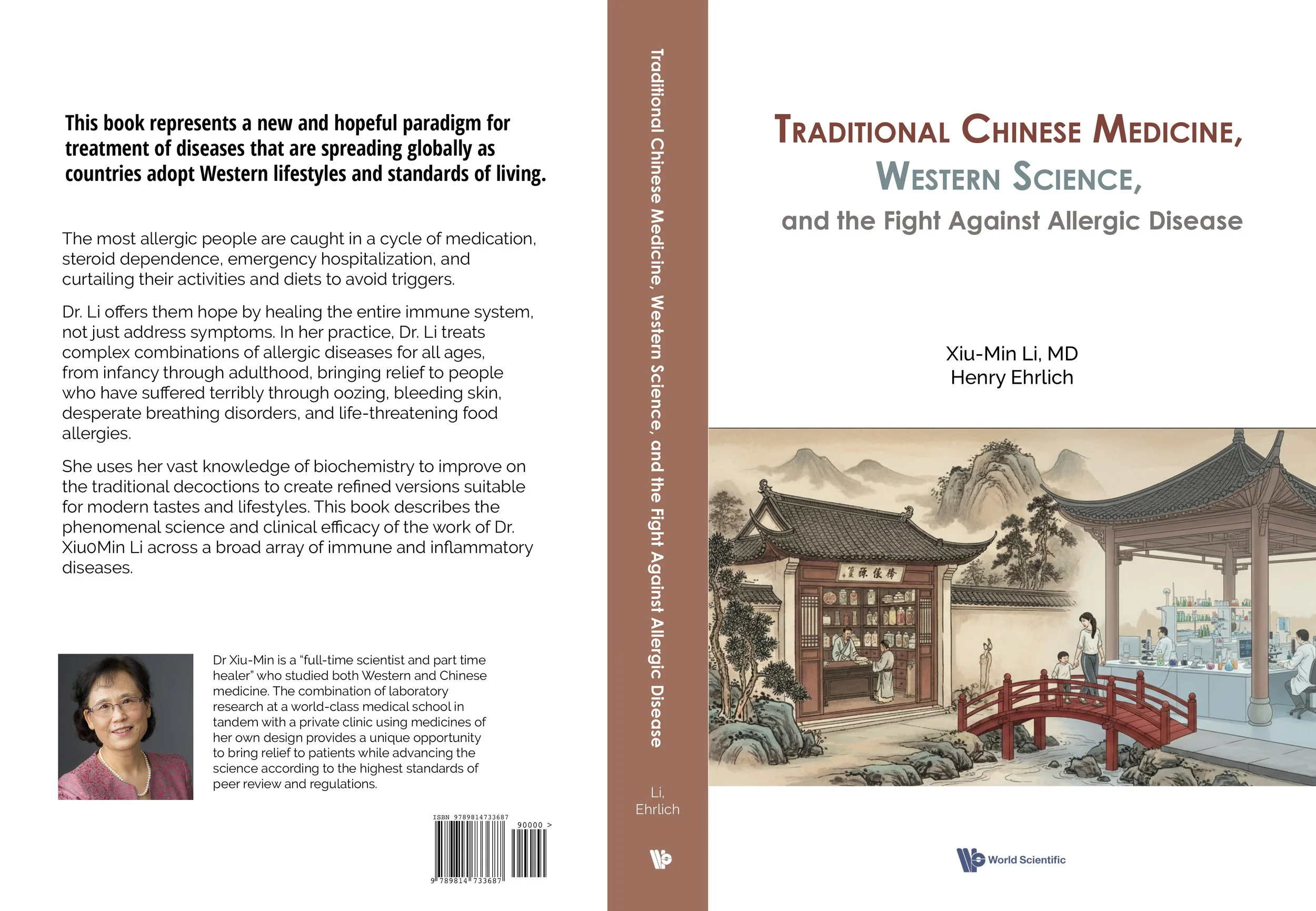
Front and back cover and spine design
Background
This book was intended to present the work of Dr. Li, who combines traditional Chinese medicine with western science to treat patients with severe allergic disease. It was written to address some skepticism in the scientific community over Li’s work, as she is trying to hold her methods up to the Food and Drug Administration’s stringent standard of proof. The original book is, thus, scientific in nature, and features page after page of dense text, as shown below.
However, the book is widely read by her patients, as they wish to better understand the science behind Dr. Li’s treatment plans which aim to rebalance the immune system, but take up to two years to begin reducing IgE levels. I wanted to redesign the book so that it is less daunting and more readable to a lay audience.

Original: Front Cover
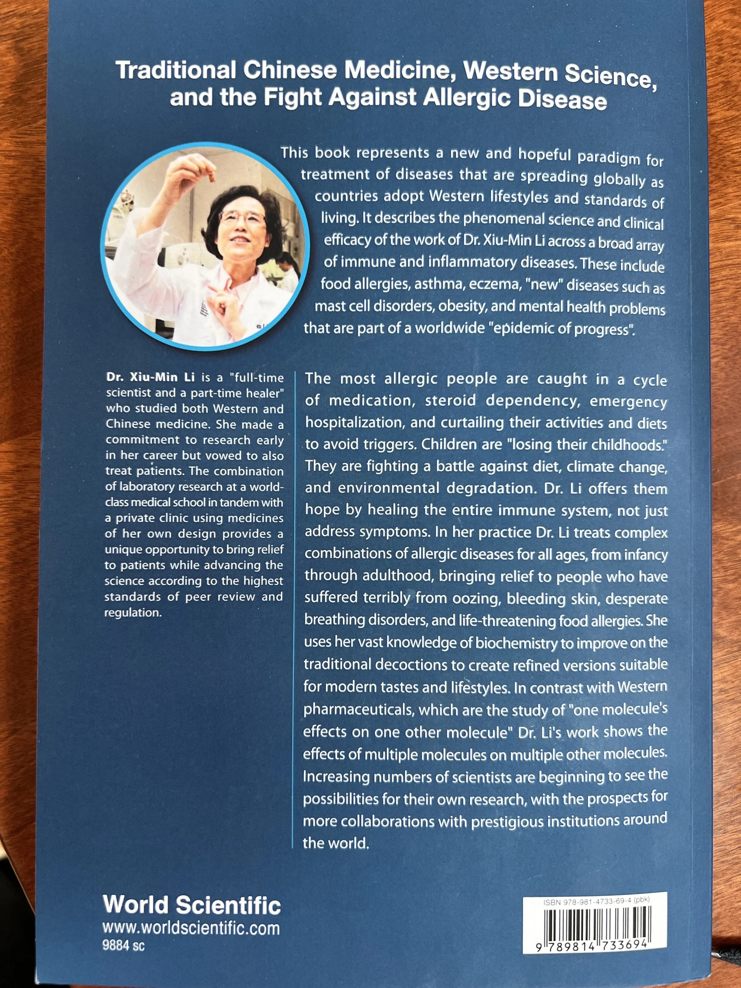
Original: Back Cover

Original: Title Page
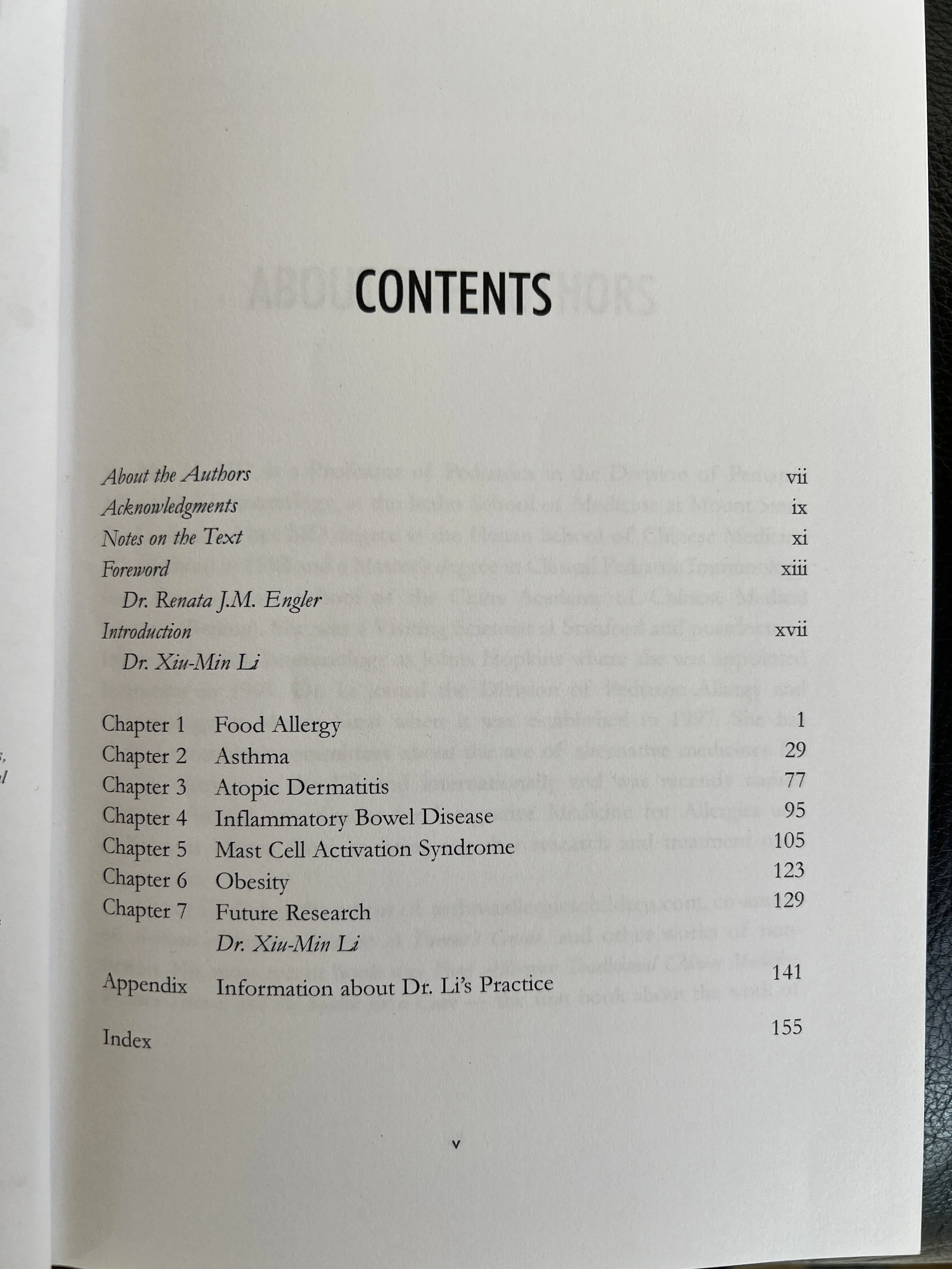
Original: Contents Page
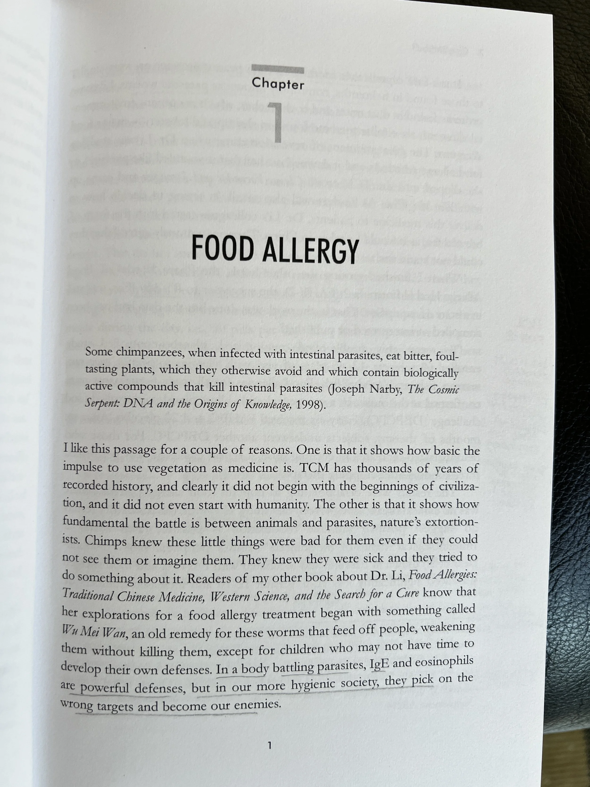
Original: Opening Chapter Page
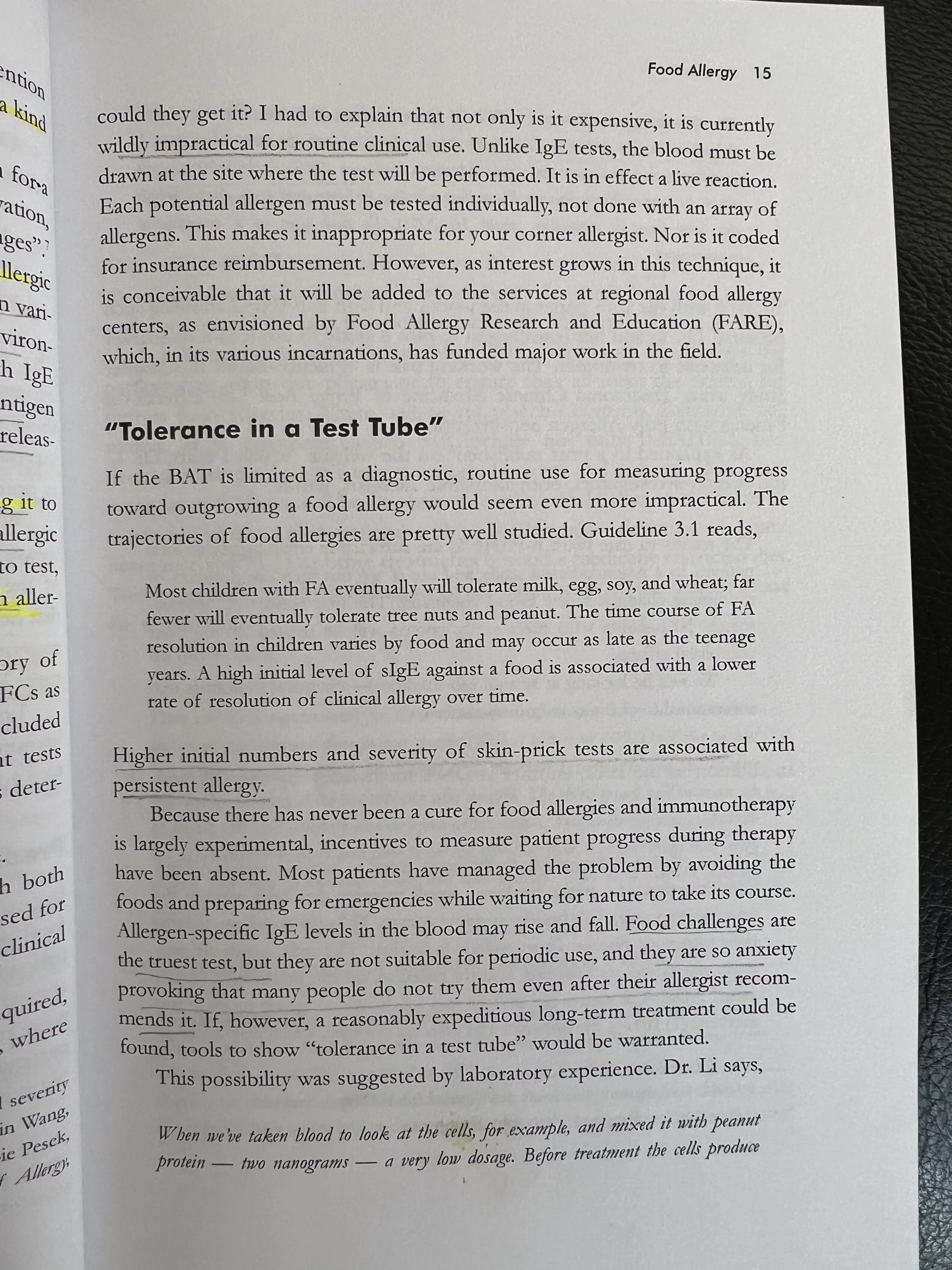
Original: Inner Right Page
Design Solution
To make it more approachable, I created a softer look and feel for the book, especially for the front cover. And, to make it more readable, I selectively added color and images to break up the dense walls of text.
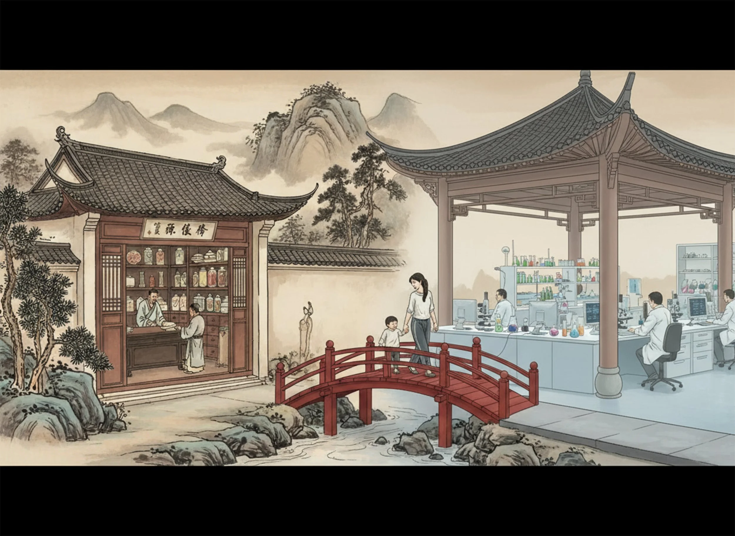
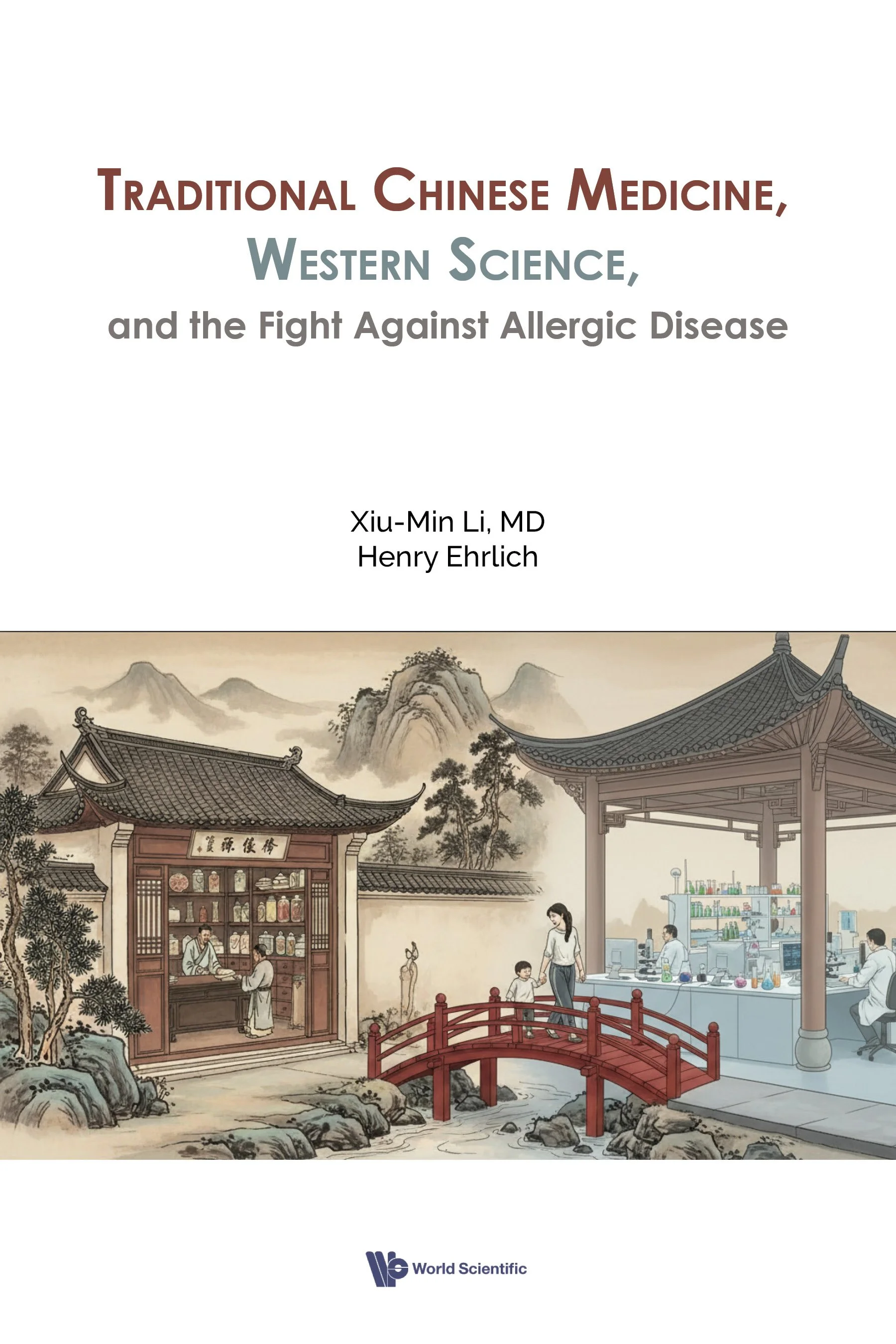
Front Cover: I used an image that features a red bridge connecting a traditional Chinese apothecary to a scientific research lab, to show that TCM and western science can be joined (“bridged”). This also places the eastern and western science side by side and connected, rather than top and bottom and divided by text. There is a mother and child crossing the bridge, to add an element of humanity and care.
One of the challenges of this book is the rather lengthy title (11 words), which makes the title hard to take in. I broke up the title into its 3 parts, by placing each part on its own line and using color to visually separate them, so the reader can read it as such. I pulled colors from the image to visually integrated text and image.
Back cover: To make the back cover easier to quickly peruse and skim, I introduced type hierarchy. It starts with a tagline in bold text, followed by a description broken up into 3 short paragraphs, ending with the author photo and bio at the bottom.
Title and contents page: Added color to create some visual interest, break up the wall of text, and create visual groupings.
Chapter opener page: added color and repeated the bridge as a motif to signal the start of the chapter and provide some visual relief from the text.
Inner pages: Added a subtle decorative element to indicate a subtopic change within the chapter. Formatted the quotes from scientific sources with indents and light font, to create a little visual interest to break up the wall of text.

Redesign: Front Cover

Redesign: Back Cover

Redesign: Title Page
Redesign: Contents Page
Redesign: Opening Chapter Page
Redesign: Inner Right Page
Design Approach
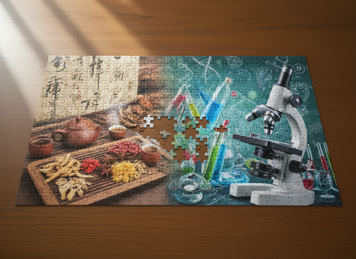
For the front cover, I decided to explore AI-generated images. I used Adobe Firefly, trying out different prompts to generate and then further edit the images. Prompts involved combinations of: medicinal herbs, microscope, lab equipment, jigsaw puzzle, bridge connecting traditional apothecary to research laboratory, top five food allergens, feeling of hope.
I chose a few of the more promising AI-generated images and made preliminary front cover designs.
Software: InDesign, Firefly, Photoshop


Front Cover: Version 1

Front Cover: version 2
Front Cover: Version 3
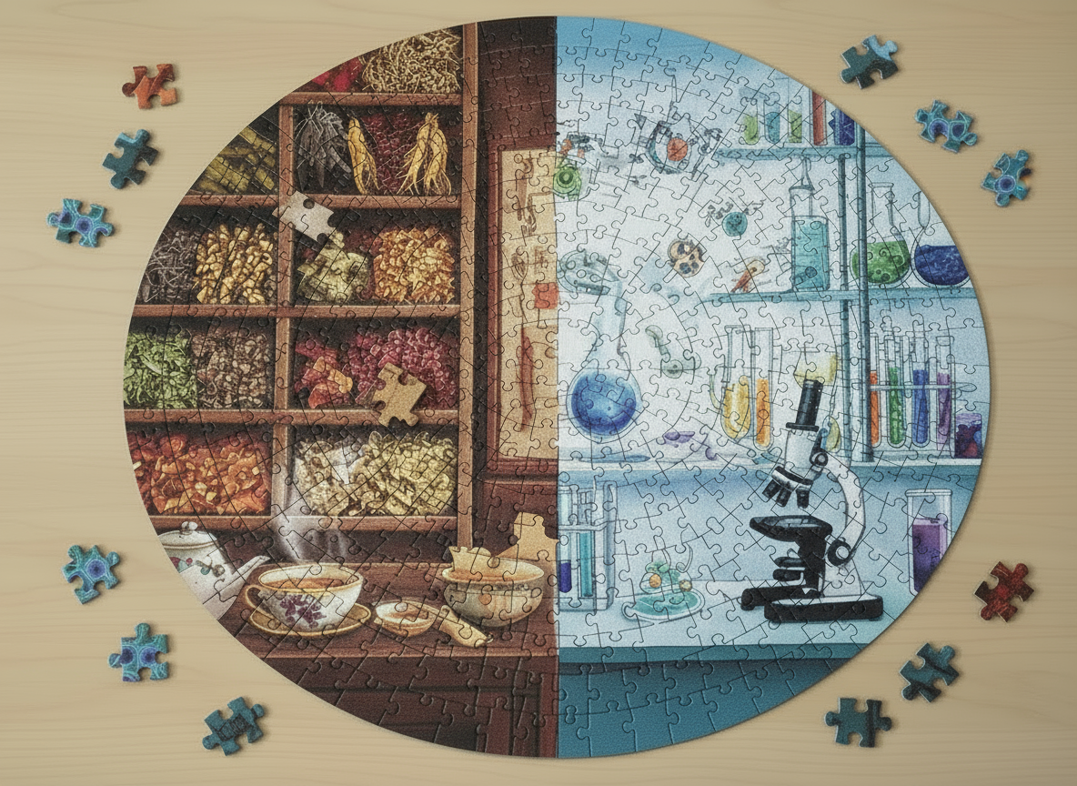
Version 1:
The title of the book is quite long, so I explored the use of color to visually break up the title for easier readability, choosing bright colors that would stand out against the darker background. The first version was interesting and gives equal attention to eastern and western medicine but was not different enough from the original cover.
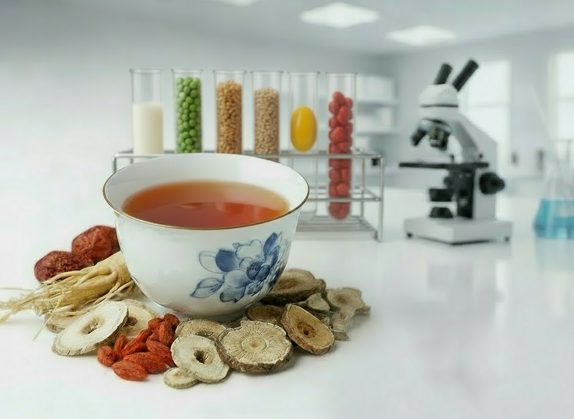
Version 2:
Similar approach as version 1 but with a different image where there’s more visual focus on the traditional Chinese medicine. But, the dark blue colors and static objects make the book feel too serious and textbook-like.
Version 3:
Here, the image has a more traditional Chinese feel to it and incorporates a bridge to signify the connection between the best of both worlds. Also, the white cover gives it a lighter, brighter look. I still used color to break up the long title, pulling color from the image to integrate text and image. This is the one with which I moved forward.
Design of back cover, spine, and front cover
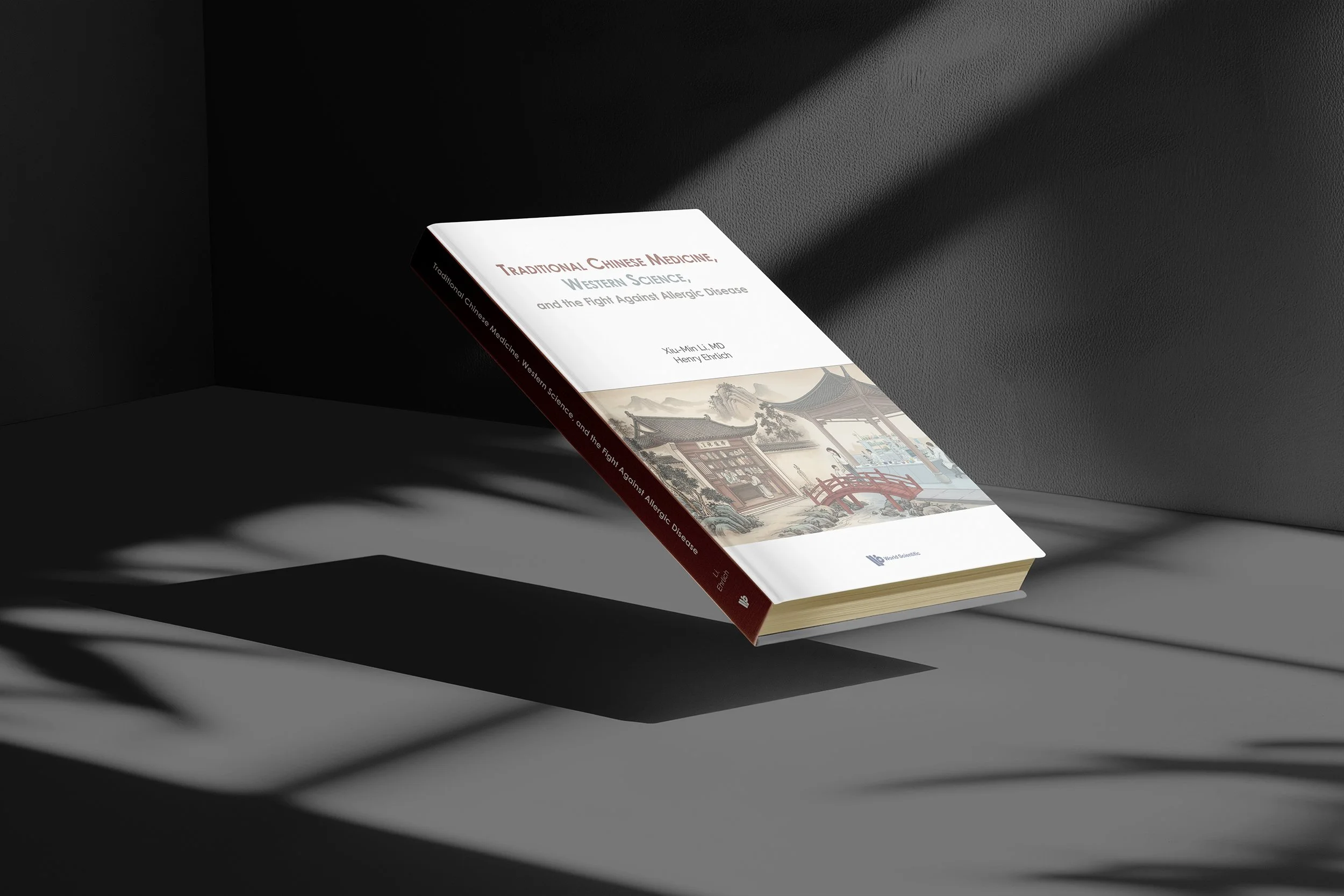
Hardcover Book
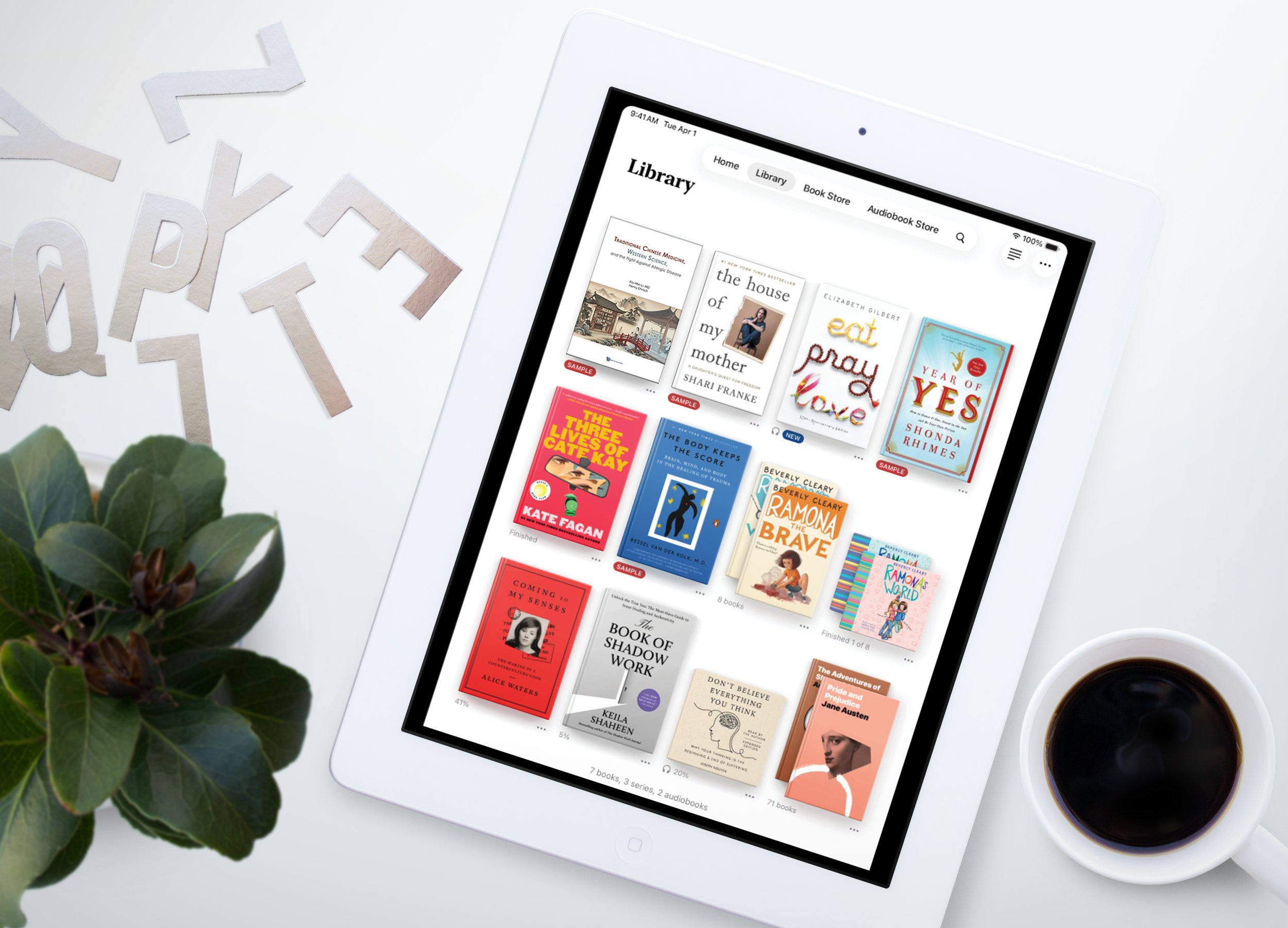
Apple Books App